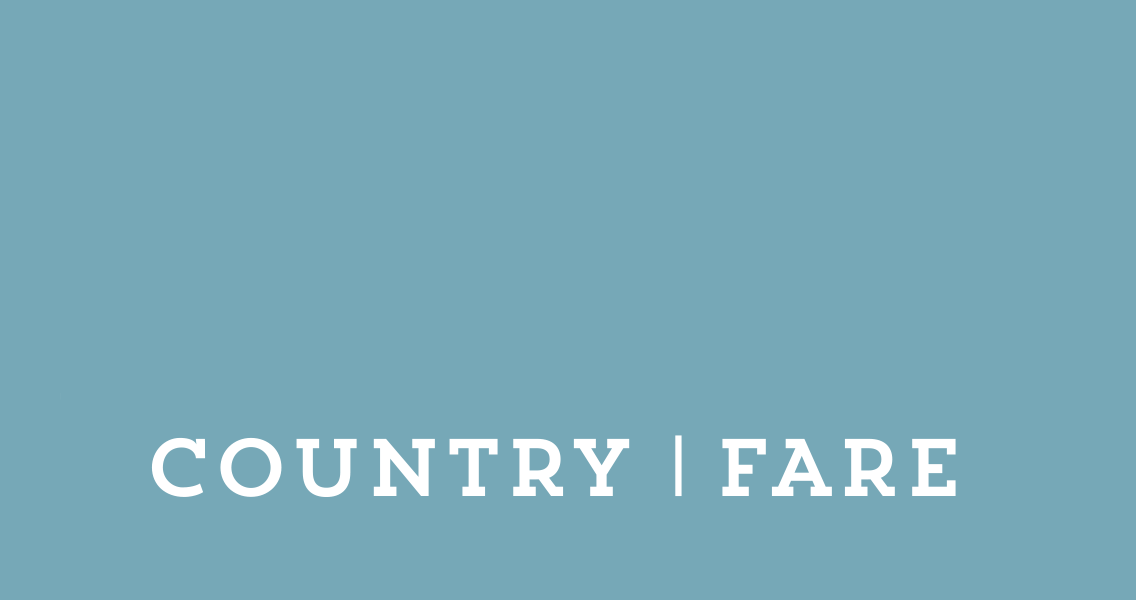
Country fare branding
Branding for Country Fare, a traditional baking company based in Cumbria. Inspired by the landscape and character of the Lake District with the combination fresh baking.
Details
Branding
Packaging
Overview
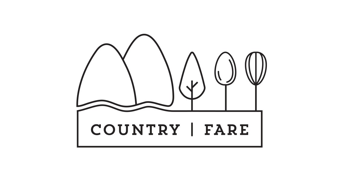
Country Fare, a traditional baking company based in Cumbria, wanted a refresh of their outdated logo to better reflect their roots and surroundings. Based on a working farm in the Upper Eden Valley – the gateway to the Lake District – the new branding draws on the natural beauty of the region. I explored elements such as mountains, waterfalls, and trees, blending them with themes of home baking to create a look that feels both local and wholesome.
Key Features
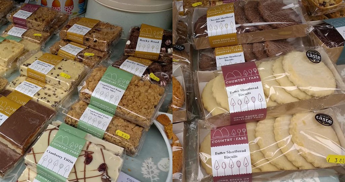
Wrap-around print strips: I worked with templates from Country Fare’s existing wrap-around strips to ensure the new design remained cohesive with their current manufacturing process. The layout allows space for cake names to be hand-stamped, and features the phrase "Handbaked on Dalefoot Farm" prominently on the side — making it clearly visible when products are stacked.
True to their process: The design stays faithful to how Country Fare actually bakes. I was careful to only include tools they genuinely use — for example, their cakes are machine-rolled, so traditional utensils like rolling pins were intentionally left out to maintain authenticity.